

101 Dalmatians
I like the style of these backgrounds, the outline is the most detailed aspect and the colour is very rough and simple.


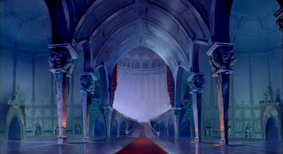
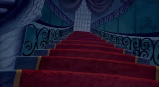
Beauty and the Beast
The first background shows so much depth it makes you believe that the castle is huge. I love the camera angle in the second background as it makes you feel very small and again making the castle feel huge. I like the colour use as well as the red colour of the carpet stands out from the blue/green walls drawing your eye to it.


Pocohontas
Again i like the colours used in these backgrounds they really create an atmosphere for the films. I like the contrast of the red and blue in the first image.
Again i like the colours used in these backgrounds they really create an atmosphere for the films. I like the contrast of the red and blue in the first image.


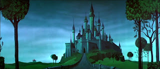
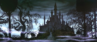
Sleeping Beauty
These two backgrounds show the same castle but in completly different moods one calm the other dark and scary. Its interesting to compare and see how they have made the castle look dark.


What's Opera Doc
I love the style of the backgrounds for this animation its very stylized and the pink in contrast with the blue pops out and makes it a lot more eye catching.
From looking at these backgrounds i can see that colour is a very important aspect of making an effective backgound so will have to look at what colours compliment each other when making my own.
No comments:
Post a Comment